Line art is the backbone of illustration, manga, and concept art. While beginners often treat lines as uniform wireframes, master draftspersons use line weight (thickness and taper) as a visual language. A single stroke can convey shadow, physical mass, distance, and surface texture before any shading is even applied.
The Three Golden Rules of Line Weight
- Light vs. Shadow: Surfaces facing your light source should have delicate, thin outlines. Surfaces turned away in shadow should have heavy, weighted lines.
- Foreground vs. Background: Objects closest to the viewer receive thicker contour lines; distant objects receive feathery, thin contours to simulate atmospheric perspective.
- Overlapping Hierarchy (T-Junctions): Whenever one form overlaps another (e.g., an arm crossing a torso), thicken the intersecting corner to create immediate optical depth.
Controlling the Pen: Wrist, Elbow, and Shoulder
Clean, confident strokes come from using the correct pivot point:
- Wrist Pivot: Use only for micro-details, cross-hatching, and tiny eyelid creases.
- Elbow Pivot: The standard engine for medium curves, petal contours, and character jawlines.
- Shoulder Pivot: Essential for long, sweeping gesture curves, spine arcs, and perspective horizon lines without wobble.
Continue Your Technique Studies
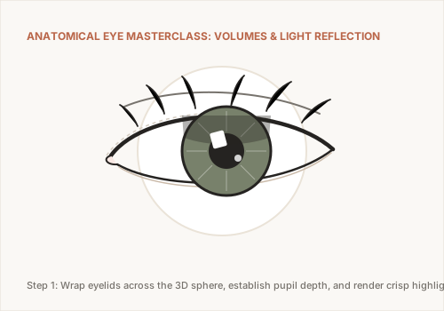
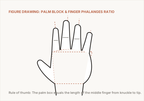
Apply line weight control to complex anatomical forms in our Drawing Hands Masterclass and Drawing Eyes Tutorial.